BottleKing
Designing the commerce experience from discovery to checkout
I designed the broader BottleKing commerce experience across web and mobile, connecting product discovery, browsing, product details, cart and checkout into a more coherent customer journey.
Skills
Product Strategy / E-commerce UX / UX Design / Interaction Design / Responsive Design / Design Systems
My Role
I owned the design experience across BottleKing's customer-facing product, working across web and mobile from discovery through checkout. I translated product requirements into journeys, interaction patterns and responsive interfaces while keeping the experience consistent across platforms.
I also worked on the supporting admin experience, giving me visibility into how the customer journey connected to the operational side of the product.
Product Context
BottleKing is an online drinks marketplace where the customer's experience needs to move quickly from discovery to a confident purchase decision.
That meant the product had to do more than display products. It needed to help users discover what they wanted, understand individual products, manage a cart and complete payment without unnecessary friction.
The Challenge
Commerce journeys are made up of many small decisions. A user can lose confidence because a product is difficult to understand, the cart feels unclear or checkout introduces unnecessary friction.
The challenge was to make the entire journey feel connected rather than treating each page as an independent interface.
How Might We
How might we create a commerce experience that helps customers move from product discovery to confident purchase with less friction?
Design Principles
01
Make products easy to understand
Give users the information they need to make a purchase decision.
02
Keep momentum through the journey
Reduce unnecessary interruptions between browsing, cart and checkout.
03
Design consistently across surfaces
Make web and mobile feel like different expressions of the same product.
Starting with discovery
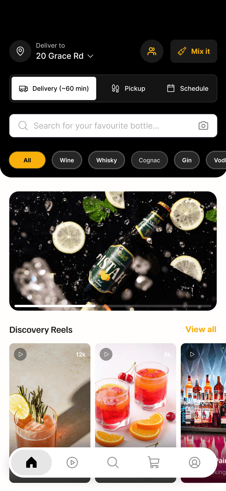
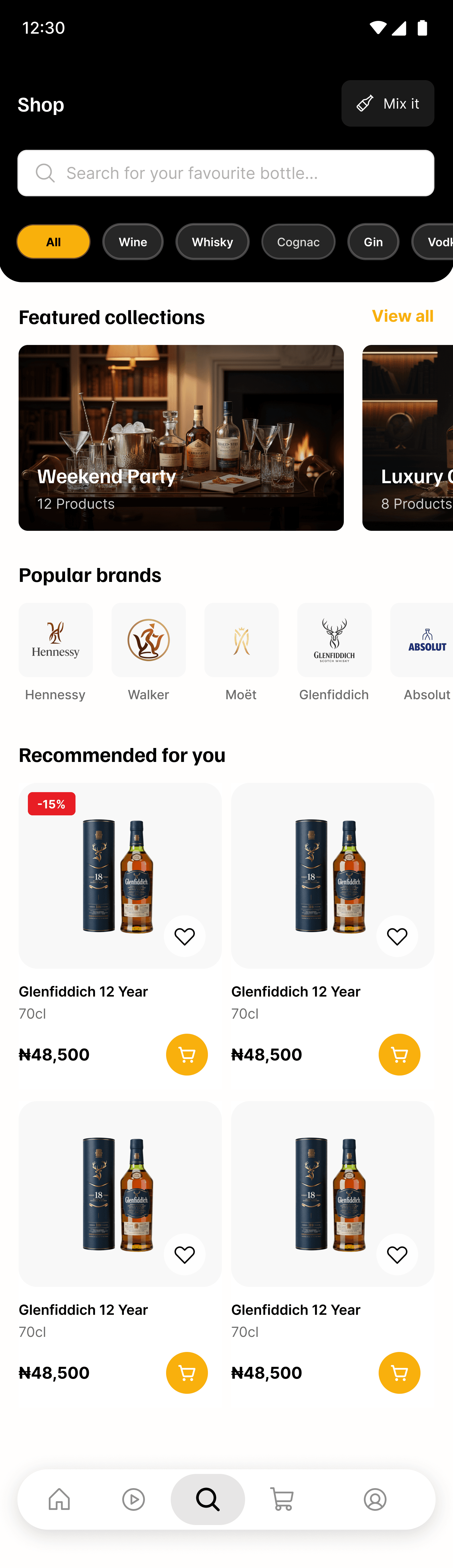
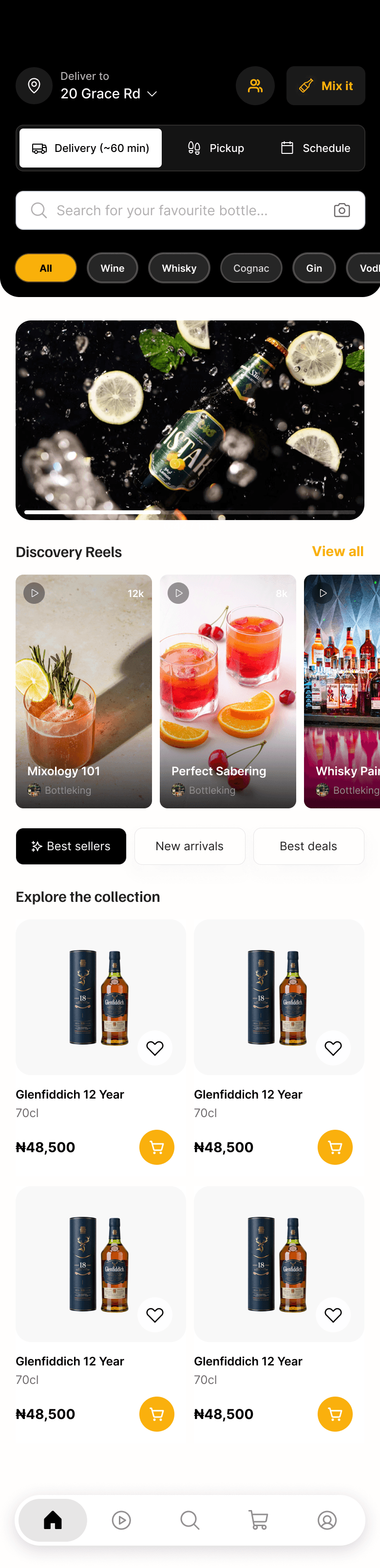
The storefront needs to answer two questions quickly: what can I buy, and what might I want? I structured the experience to make product discovery feel immediate while giving users clear paths into categories, products and deeper browsing.
Helping users move from interest to intent
Product cards and browsing patterns were designed to give users enough information to decide whether to explore further without making the storefront feel overloaded.
Making the product decision clear
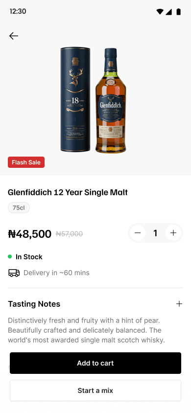
Once a user opens a product, the interface needs to shift from discovery to decision. The product detail experience brings the relevant information together so users can understand what they are buying and add it to their order with confidence.
Creating a clear cart experience
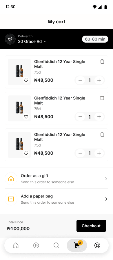
The cart is the point where browsing becomes a purchase. I focused on making selected items, quantities, totals and next steps easy to scan so users can review their order without losing momentum.
Reducing friction at checkout
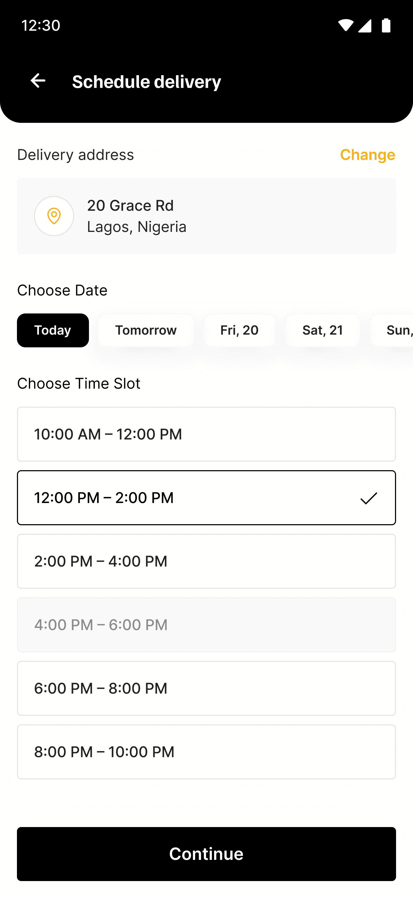
Checkout needs to feel predictable. The user's job is simple: confirm the order, provide the required information and pay. The design keeps the decision path clear and reduces unnecessary cognitive load at the point where intent is highest.

Building consistency as the product grew
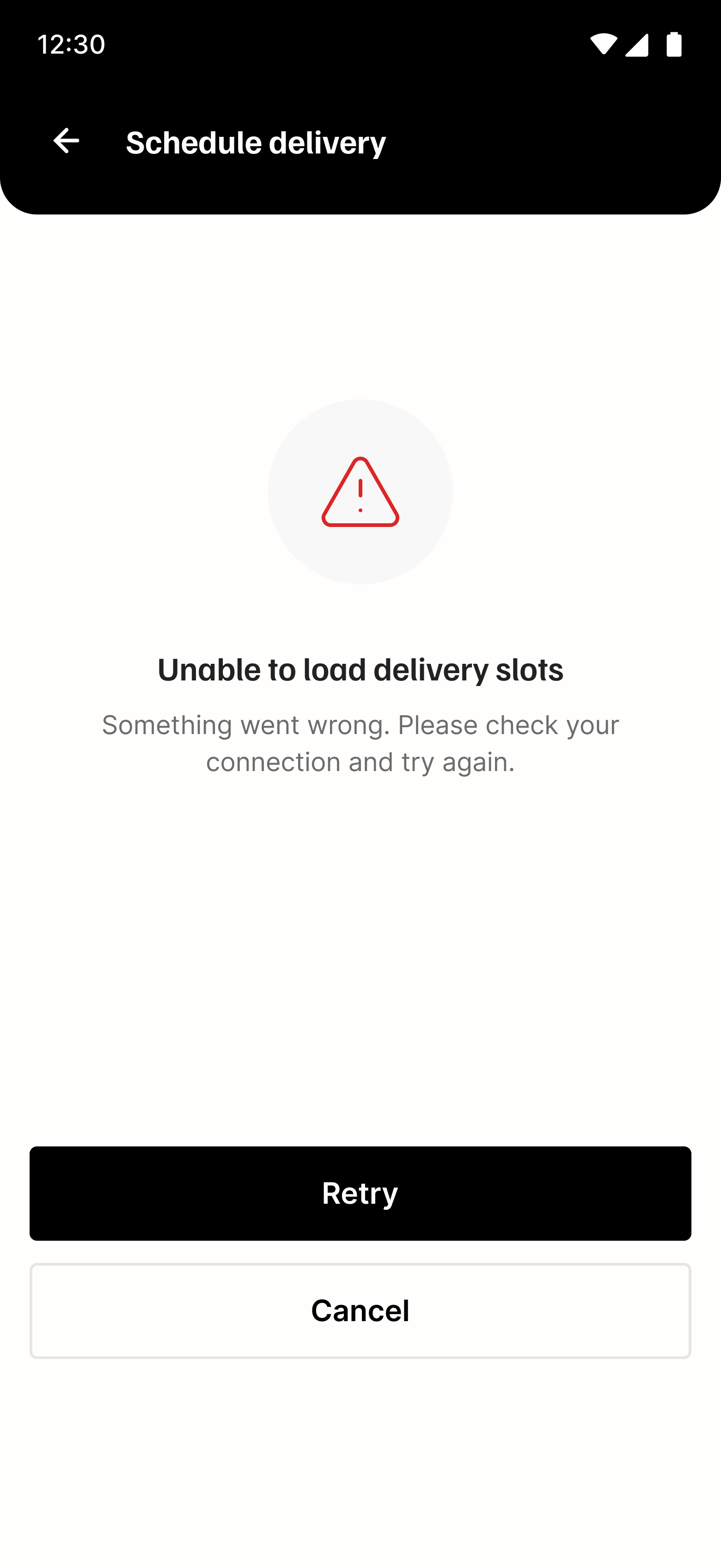
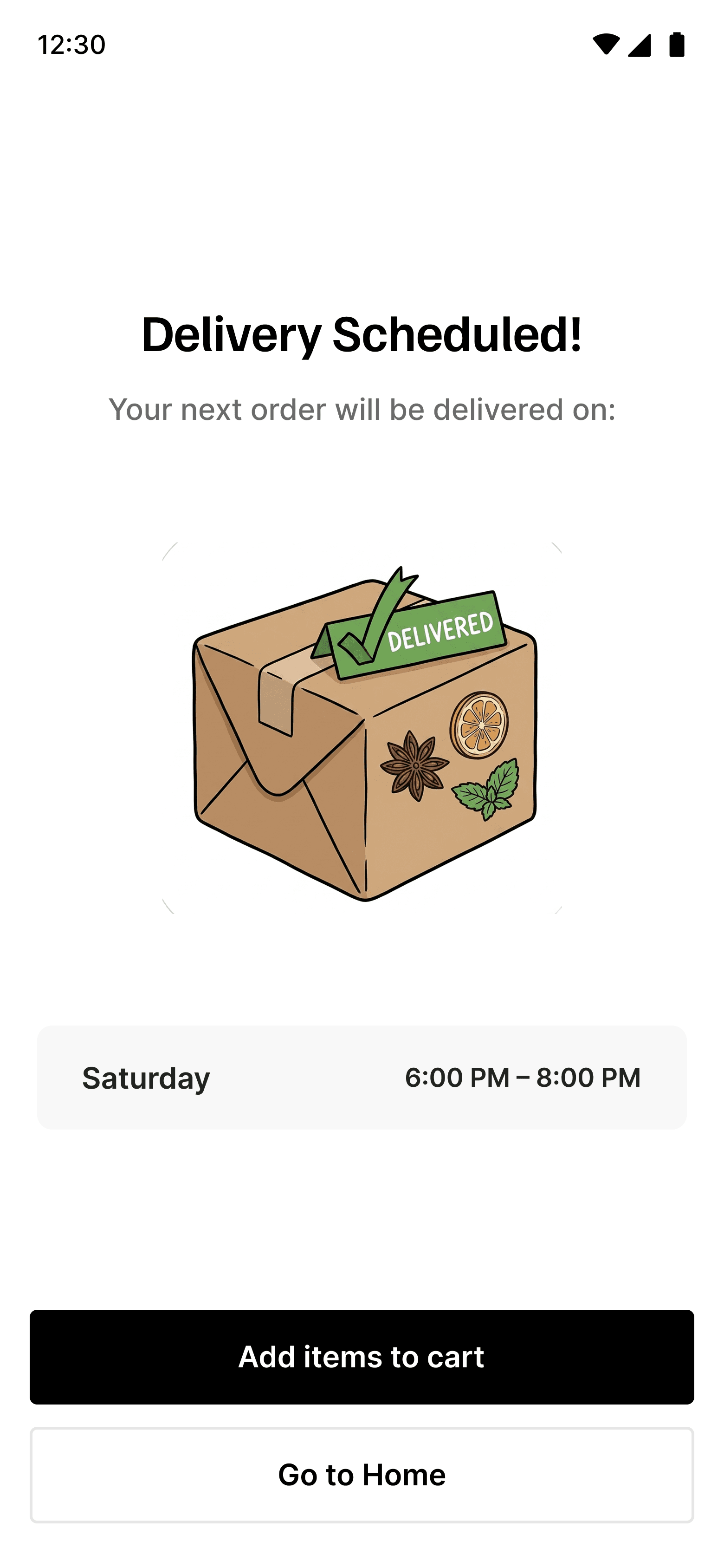
Working across a growing commerce product meant maintaining consistency across repeated patterns such as product cards, status treatments, actions and transactional states. Reusing established patterns reduced visual drift and made new experiences feel native to the product.
Decision
Keep the purchase journey continuous from discovery to checkout.
Why
The user should always understand what step they are in and what action comes next.
Impact
The work established a clearer end-to-end commerce experience across BottleKing's customer-facing surfaces, creating a stronger foundation for discovery, purchase and future product growth.
What I learned
Good commerce UX is less about individual pages and more about momentum. Every interaction either moves the customer closer to a confident purchase or gives them a reason to stop.
This project strengthened how I think about connected journeys, responsive product design and the relationship between discovery and conversion.
Try it yourself