Divest
Redesigning Divest around a remittance-first experience
Divest was evolving from a crypto-first product into a remittance-first financial platform. I worked on the redesigned mobile experience across Money Xchange, Rates and Profile Management, helping make international money movement clearer, faster and easier to trust.
Visit Divest website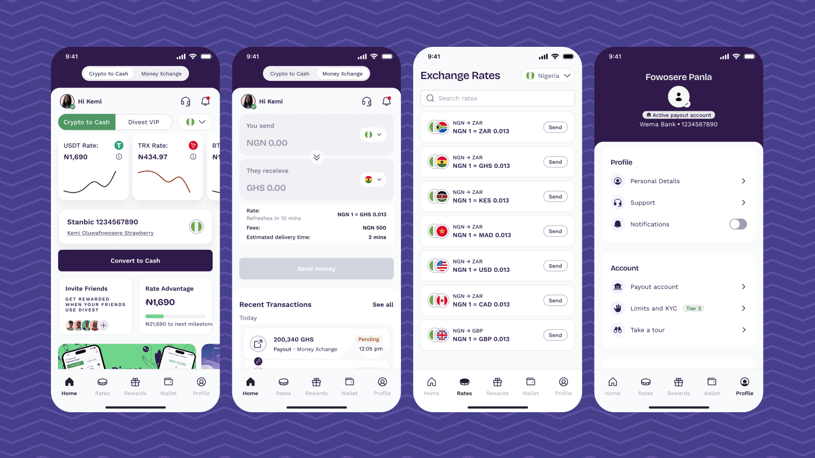
Skills
Product Strategy / UX Design / Interaction Design / Information Architecture / Fintech / Mobile Product Design
My Role
I was one of three designers working on the V3 redesign. My primary ownership was the Money Exchange experience end-to-end, alongside the Rates and Profile Management sections. I worked closely with Product, Engineering and QA to translate product requirements into clear flows, resolve edge cases and maintain consistency across the redesigned experience.
Impact in Numbers
350,000+
Divest users
$1M+
In transactions processed in Nigeria
4
Countries: Nigeria, South Africa, Ghana and Kenya
Product Context
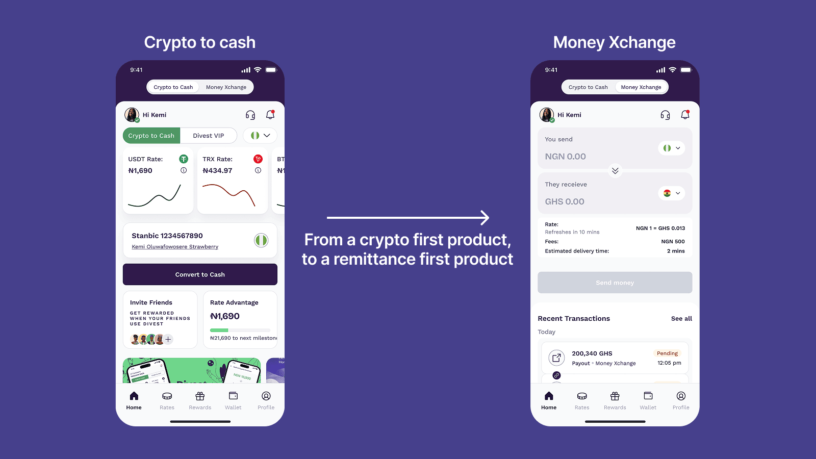
Divest was repositioning from being primarily associated with crypto toward a remittance-first financial product. The redesign needed to support users who move money across African markets while still accommodating Divest's existing crypto experience.
This created a broader UX challenge than simply updating the interface. The product needed clearer navigation between different financial modes, a more understandable Money Xchange experience, visible exchange rates and a profile structure that could support security, account management and future growth.
The Challenge
The core challenge was making a growing financial product easier to understand without hiding the complexity behind the transactions. Users needed to know what they were sending, where their money was going, what rate they were receiving and what would happen next.
At the same time, the redesign had to support different currencies, payment methods, KYC requirements, transaction limits, validation states and failure scenarios.
What users need to see
What am I sending?
Send amount and currency, entered up front
Where is it going?
Destination currency and recipient details
What rate am I getting?
Rate, fees and when the rate refreshes
What happens next?
Estimated delivery time and transaction status
How Might We
How might we redesign Divest's mobile experience to make international money movement simpler, faster and more trustworthy while supporting the company's next stage of growth?
Design Principles
01
Reduce friction
Remove unnecessary decisions from transaction flows and make common actions easier to complete.
02
Build trust
Make rates, fees, validation, transaction states and requirements visible at the right moment.
03
Design for growth
Create structures that can support additional corridors, products and account capabilities without rebuilding the experience.
Product Architecture
One of the early design challenges was giving the product a clearer structure as Divest expanded beyond its original crypto-first experience. The redesigned architecture needed to separate major financial modes while still making the overall product feel like one system.
Divest app
Mode toggle · remembers the last mode
Crypto to Cash
Own dashboard
- Crypto rate cards
- Retail and Divest VIP views
- Convert to cash
Money Xchange
Own dashboard
- You send / they receive
- Rate, fees and delivery time
- Send money
Shared across both modes
Home
- Account overview
- Recent transactions
Rates
- Browse exchange rates
- Send opens Money Xchange
Rewards
- Rewards overview
- Stamps & benefits
Wallet
- Balances
- Fund wallet
- Withdraw
Profile
- Personal details
- Payout accounts
- KYC & limits
- Security & legal
Designing the core money movement experience
Money Exchange was the largest area of my ownership. The flow had to support the complete journey from entering an amount and selecting currencies to choosing a payment method, providing recipient details, reviewing the transaction and completing payment.
The complexity wasn't in the happy path alone. The experience also needed to handle KYC gates, amount limits, beneficiary validation, country-specific payment methods, failed verification and changing transaction states.
Scroll sideways to see the full diagram →
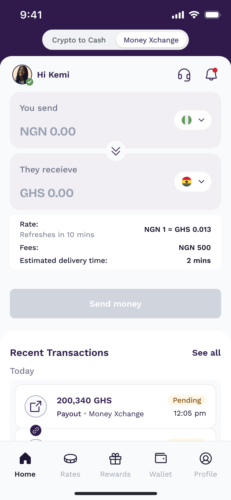
Mode toggle
Switches between Crypto to Cash and Money Xchange. The app returns users to the mode they last used.
You send
The amount and currency the user is sending from.
They receive
The destination currency and the amount the recipient gets.
Rate with refresh timer
The current rate, with a clear indication of when it refreshes.
Fees & delivery time
Costs and timing are visible before the user commits.
Send money
Starts the flow, checking KYC status before the user continues.
Designing for the moments that can break trust
Financial flows are only as good as the states users encounter when something doesn't go as expected. I designed the experience around insufficient balances, amount limits, KYC verification requirements, invalid recipient details and payment failures rather than treating them as secondary screens.

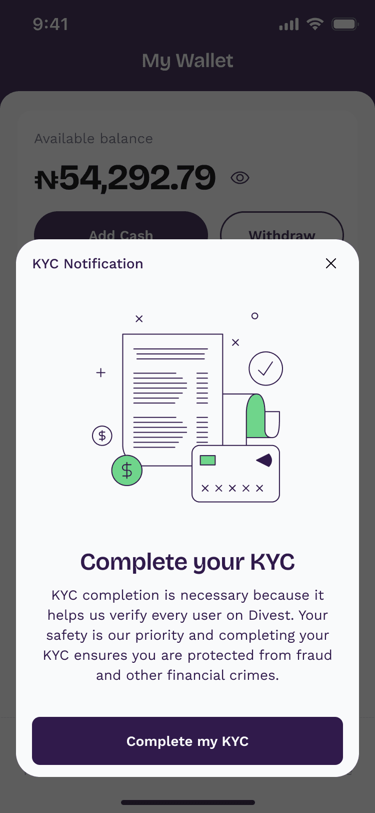
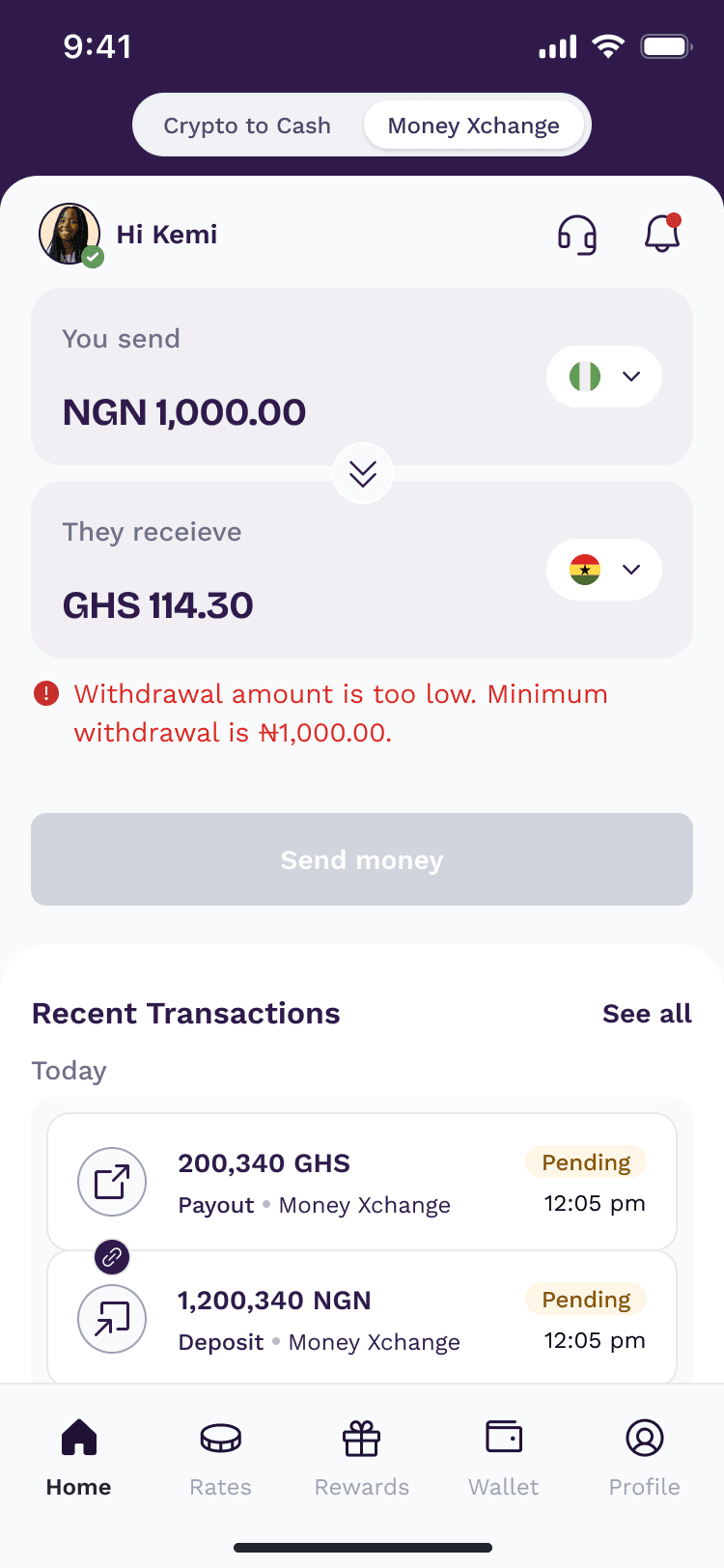
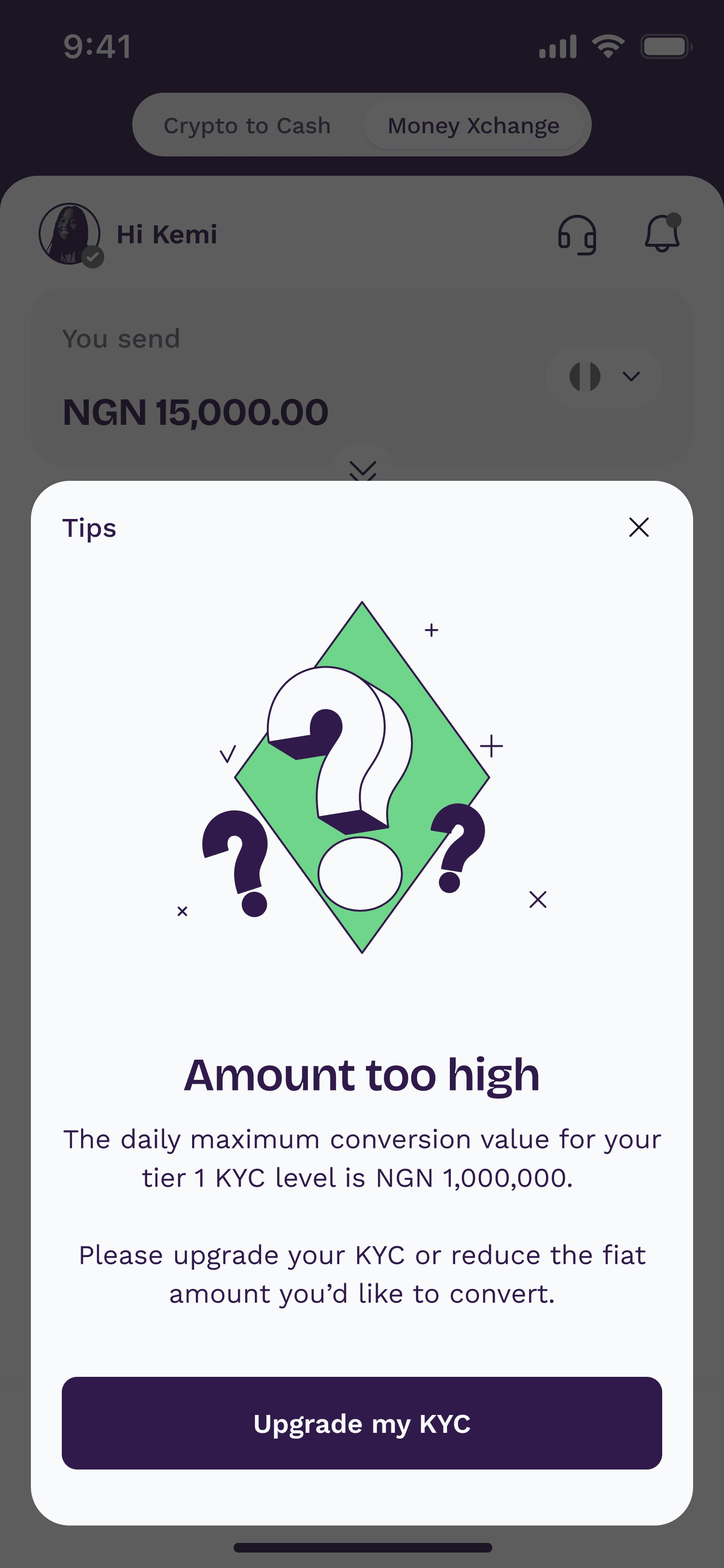
An unverified user tries to send
A KYC prompt explains why verification matters and takes the user straight into verification.
Making rates actionable
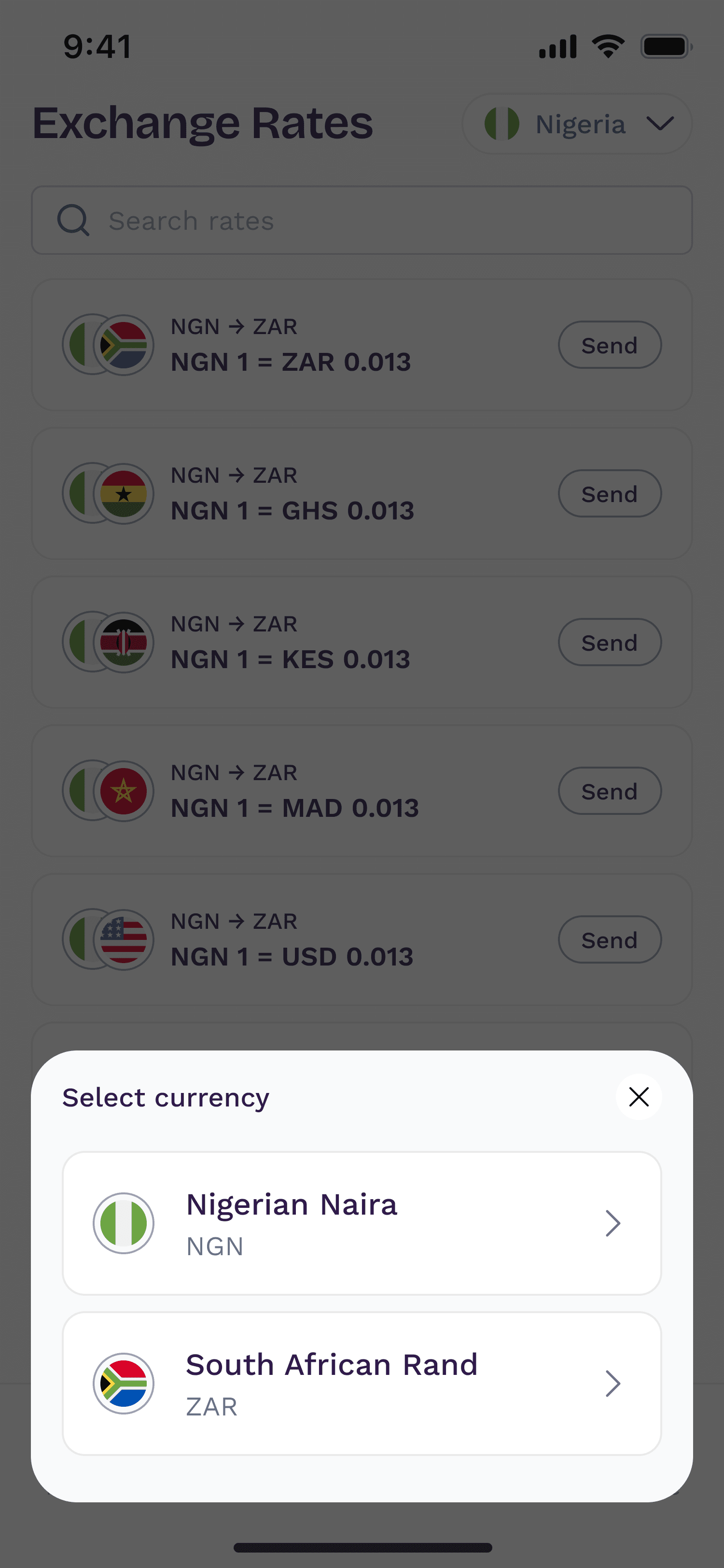
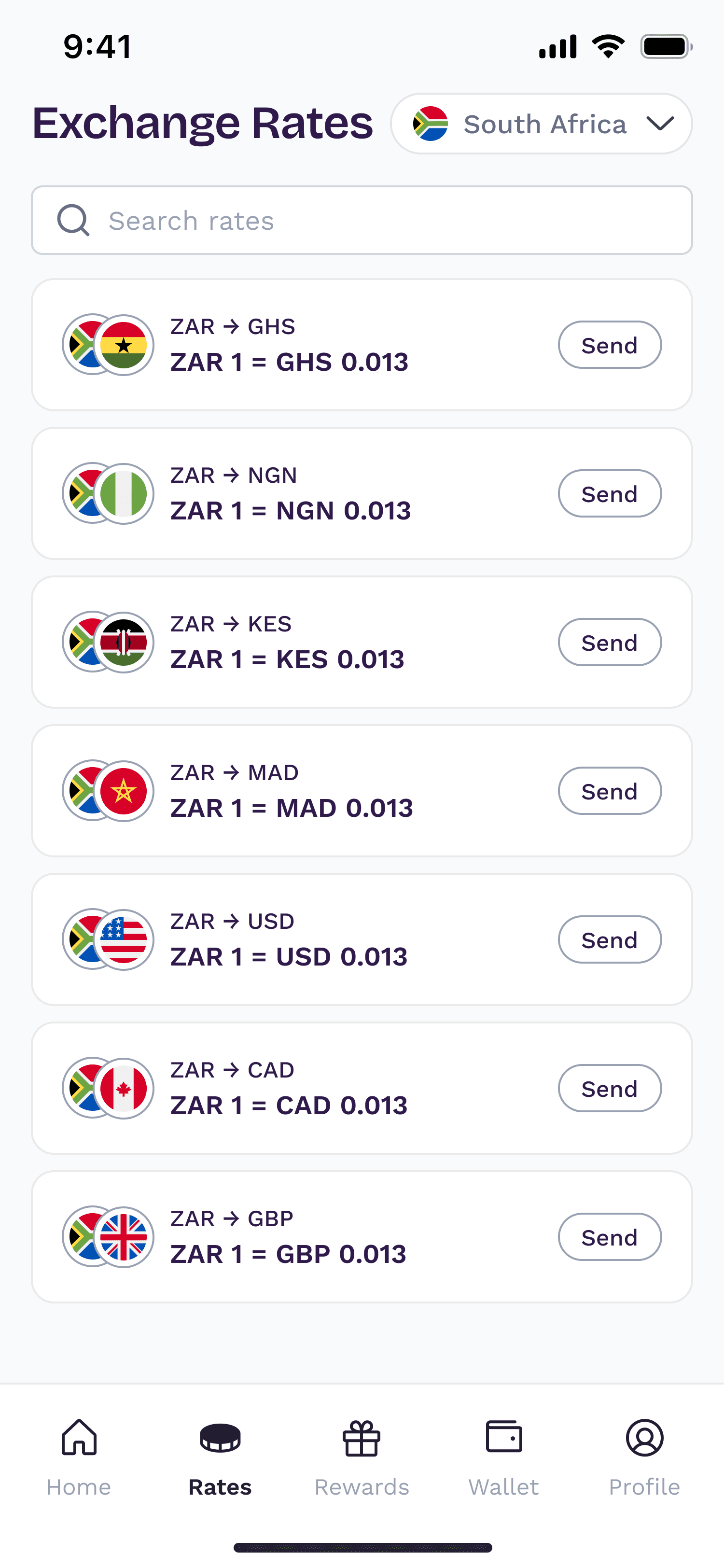
Rates should not be a dead-end information page. I designed the Rates experience so users could understand available conversion rates and move directly into the relevant transaction.
The “Send” action carries the selected currency pair into Money Exchange, reducing repeated input and creating a direct path from information to action.
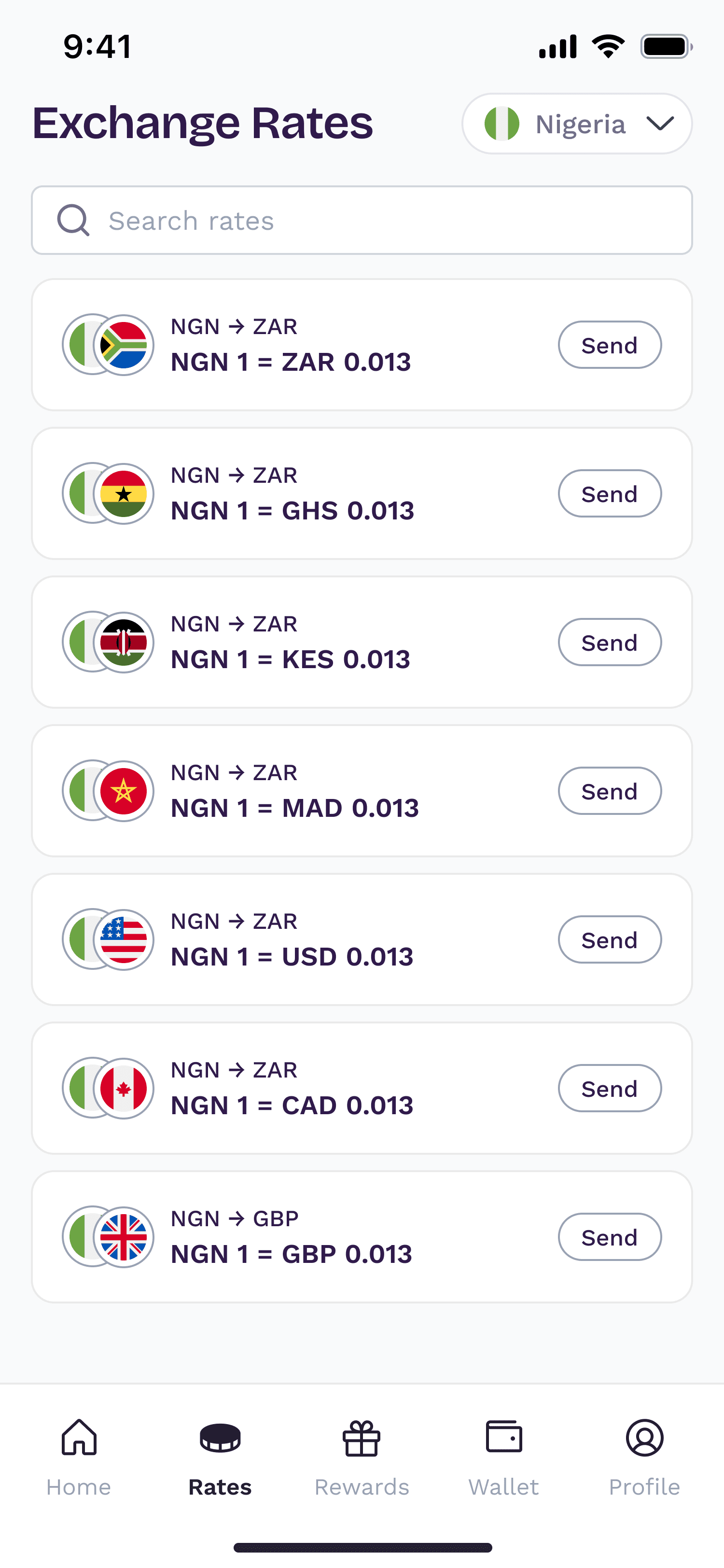
Country selector
Rates start from the user's local currency and can be switched to other supported countries.
Search
Find a specific corridor quickly as the list grows.
Corridor and rate
Each row shows the currency pair and its current rate.
Send
Opens Money Xchange with the selected currency pair already filled in.
Turning profile into a product system
Rather than treating Profile as a collection of settings, I structured it around the tasks users actually need to manage: personal information, payout accounts, KYC and limits, security and legal information.
Profile
Profile
- Profile & background photo
- Personal details
- Support
- Notifications
Account
- Payout accounts
- Limits & KYC
- Take a tour
Security
- Update password
- Reset PIN
Legal
- Terms & conditions
- Privacy policy
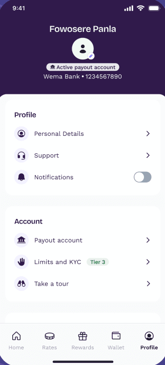
Identity header
The user's name and photo, with editable profile and background images.
Active payout account
The primary payout account is visible without opening settings.
Profile
Personal details, support and notification preferences.
Account
Payout accounts, KYC tier and limits, and a product tour.
Decision
Group profile responsibilities by user intent rather than by backend structure.
Why
This reduces cognitive load and makes account management easier to scan.
Designing with the product team
The work involved close collaboration with Product, Engineering and QA. Requirements often exposed edge cases that changed how a flow needed to behave, so design decisions had to account for both the intended experience and the underlying product rules.
I used these conversations to refine flows, resolve ambiguity and make sure the final screens were practical to build and consistent across the product.
Product requirement
Design response
The selected mode should persist across sessions.
The toggle remembers the last mode, so users return to Money Xchange or Crypto to Cash where they left off.
Payment options depend on what each corridor's provider supports.
The payment method screen shows only the options available for that country: MoMo, bank account or both.
Users must transfer the exact amount, once, from an account in their own name.
A transfer notice with a confirmation checkbox comes before the payment details.
Rates should lead directly to a transfer.
Send on each rate opens Money Xchange with the currency pair filled in.
Iteration
The work evolved through repeated refinement of transaction states, hierarchy and navigation. Rather than treating the first high-fidelity design as final, I used edge cases and implementation feedback to simplify the experience where possible and make important information more visible.
Impact
The redesigned experience established a clearer foundation for Divest's remittance-first direction and created a more structured system for money movement, rates and account management.
What I learned
Redesigning a financial product is rarely about making individual screens cleaner. The harder problem is making the relationships between screens, rules and decisions easier for users to understand.
This project strengthened how I think about state management, progressive disclosure and trust in financial flows — especially when a user is moving real money through a system with multiple constraints.
Try it yourself
Get the Divest app
Previous
Coming soon
Next
Cross-Border Financial Platform